Abstract Creative Marketing
The brand needed to be big and bold, the very essence of what Abstract are all about. Small players with big ideas.
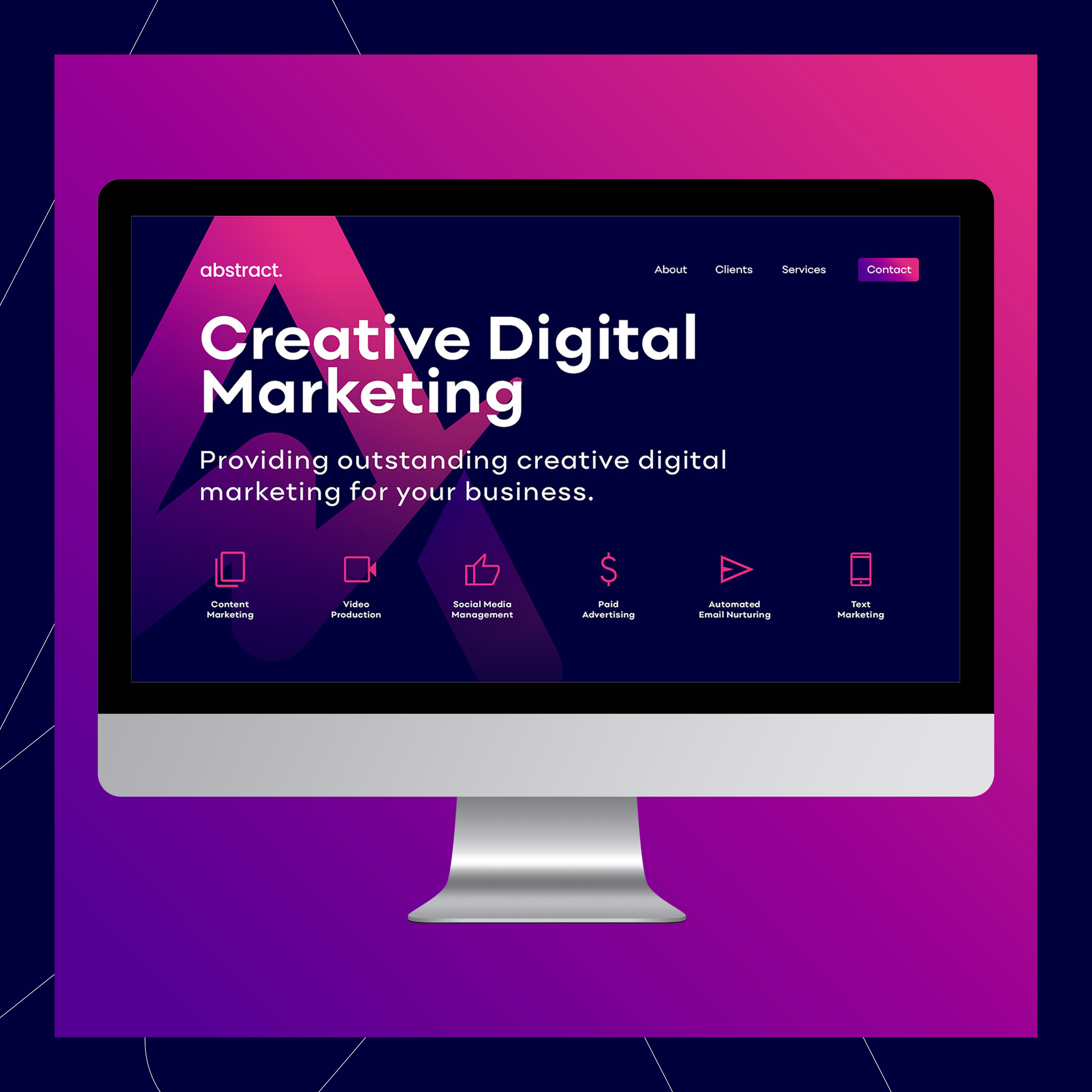
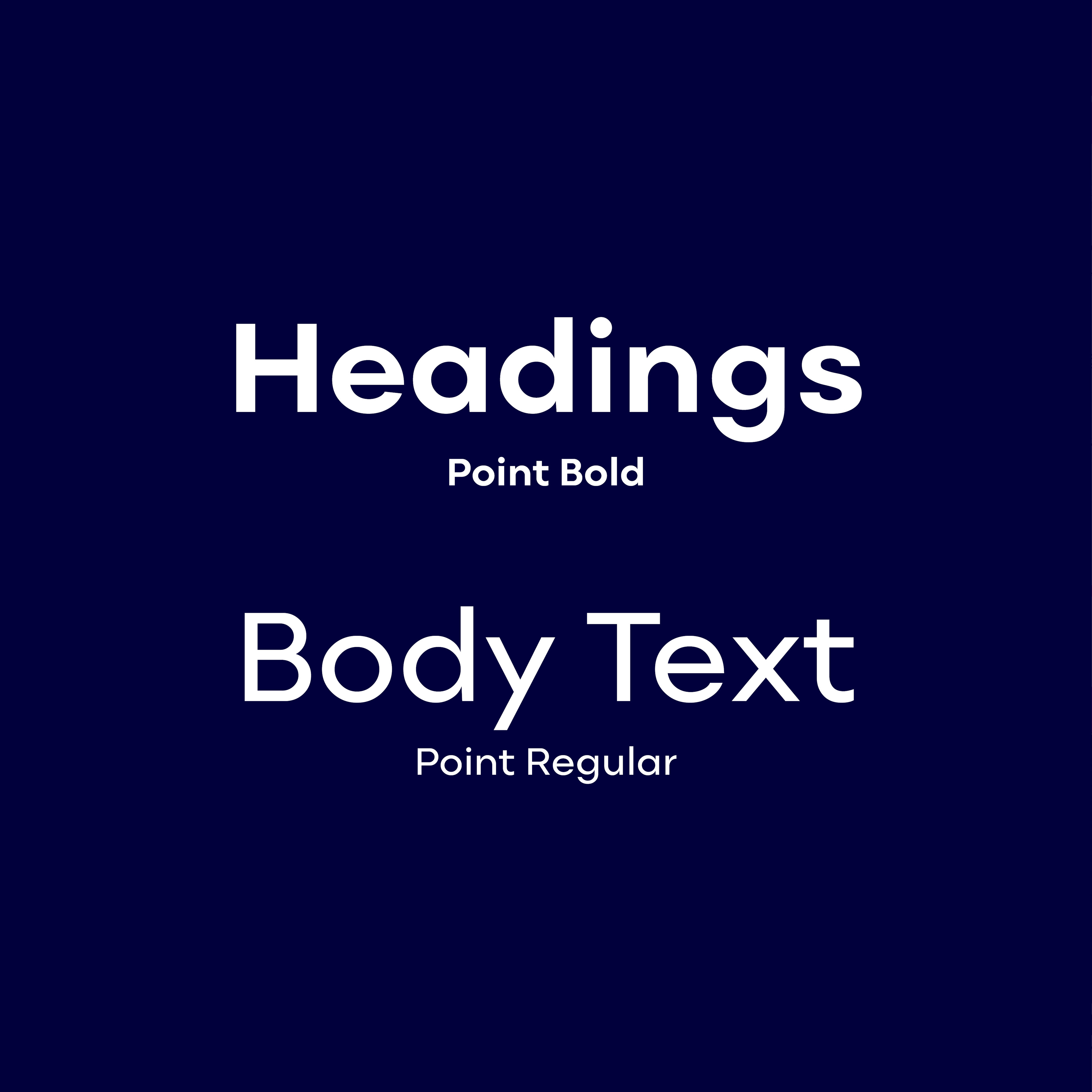
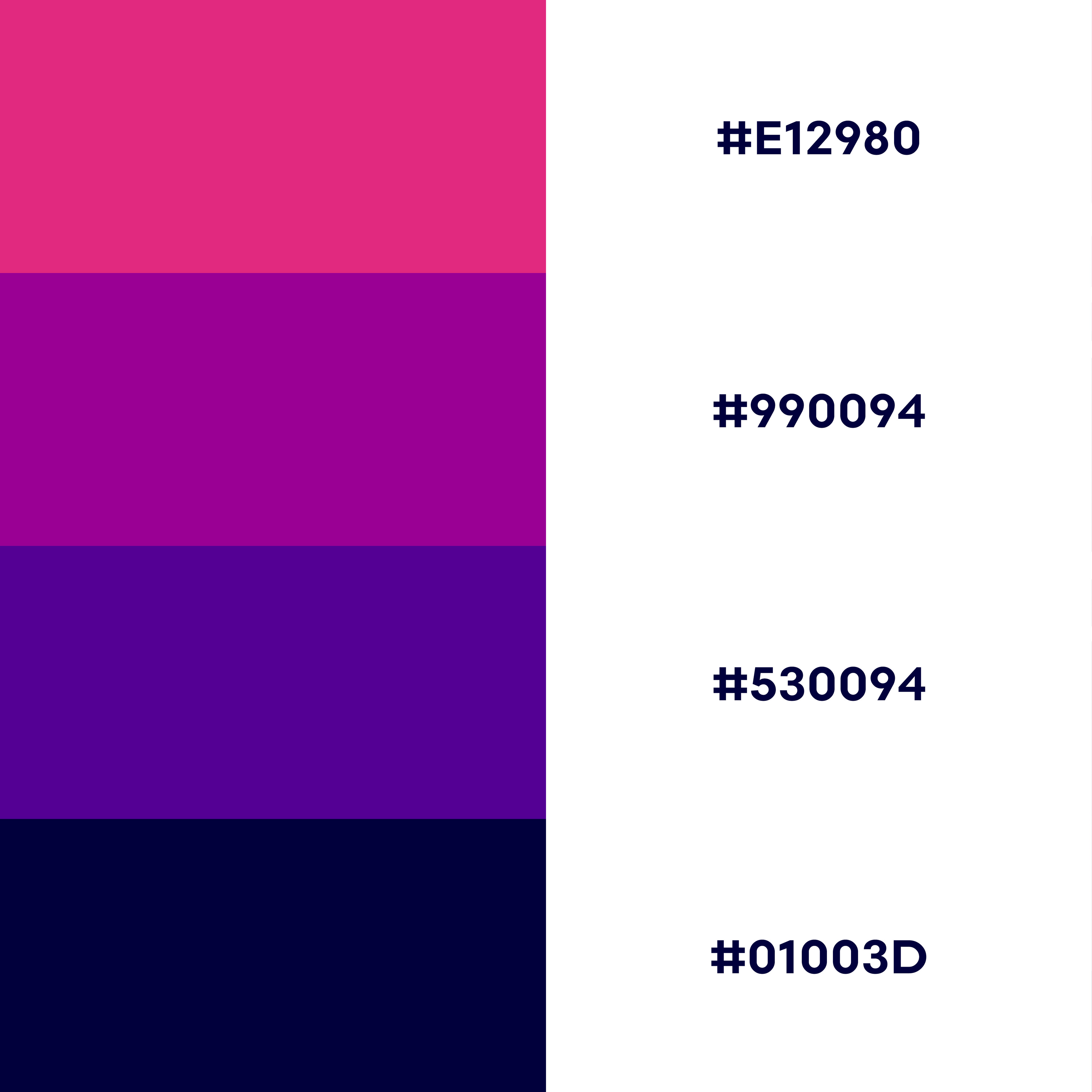
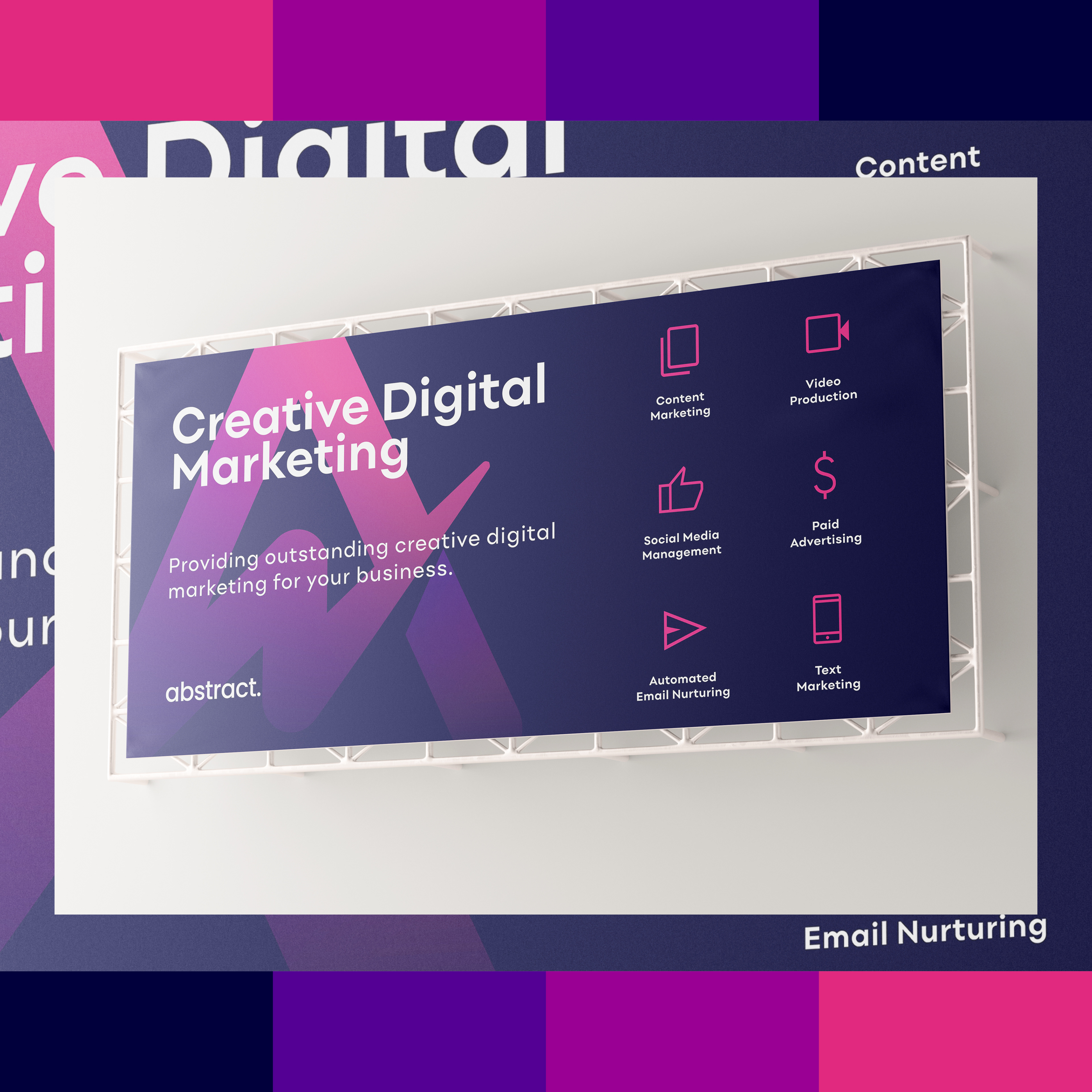
Bold colours, a simple font and a clever symbol. The icon is the focus of the brand, combining an uppercase A with the upward movement of a line graph to create an iconic look with a little insight of what the brand are about. Coupling the icon with a clean and simple font with a couple of personalised tweaks, helps balance the logo. The colours are a mix of "fun & bright" and "business as usual". The project included a bold and modern logo, a new visual identity, a website mockup, social media post designs and print advertising.
